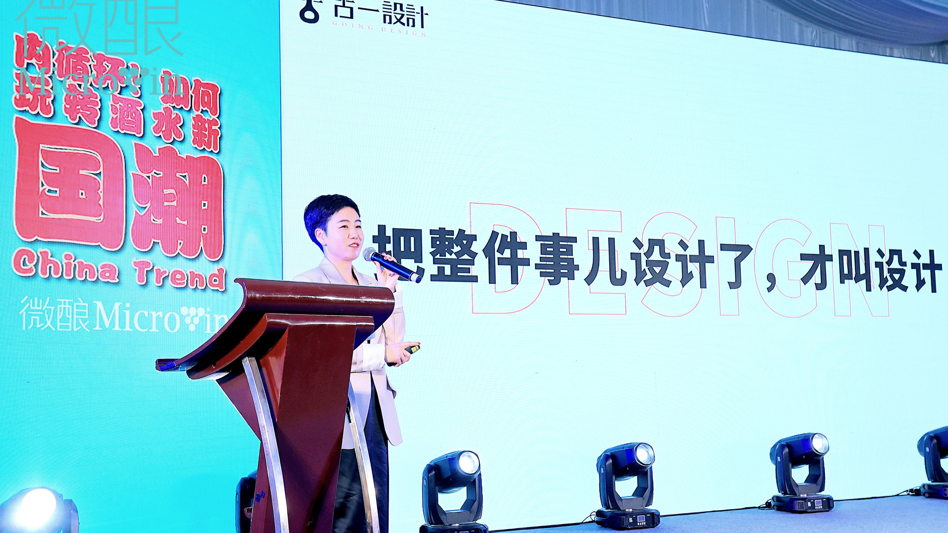
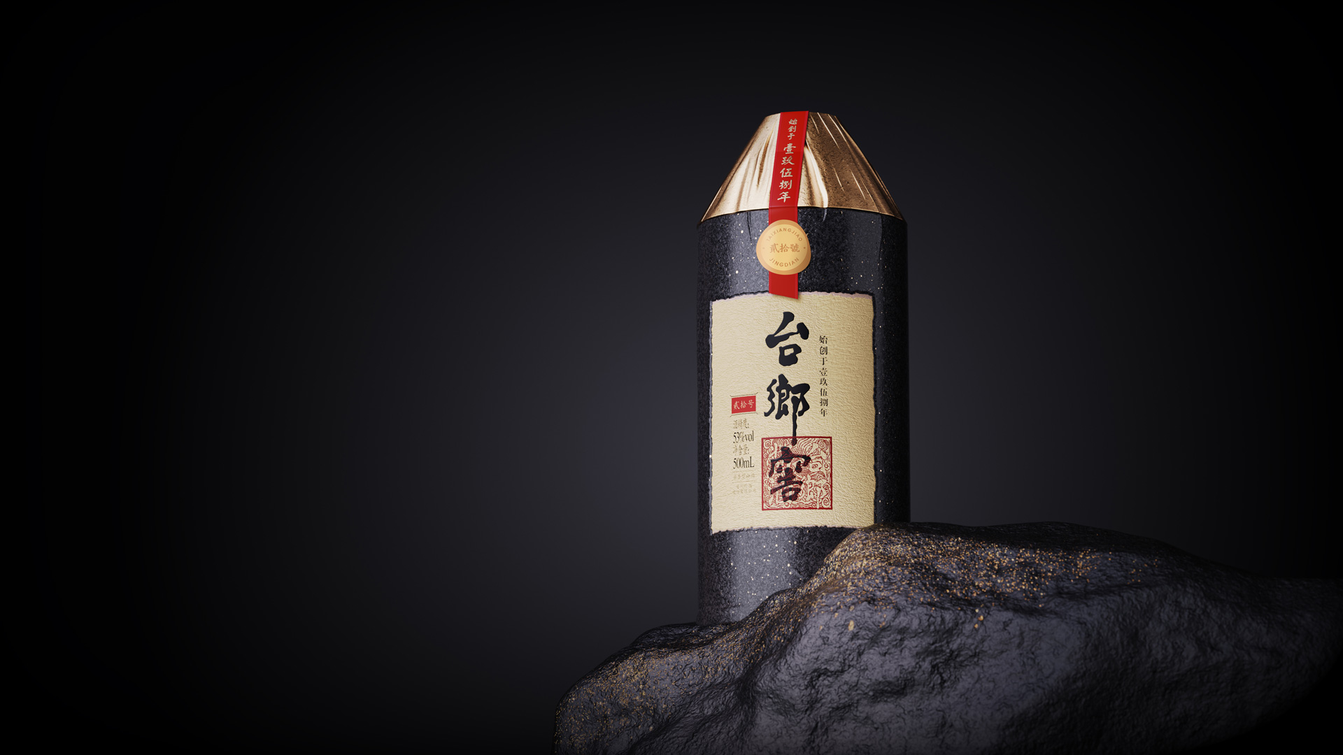
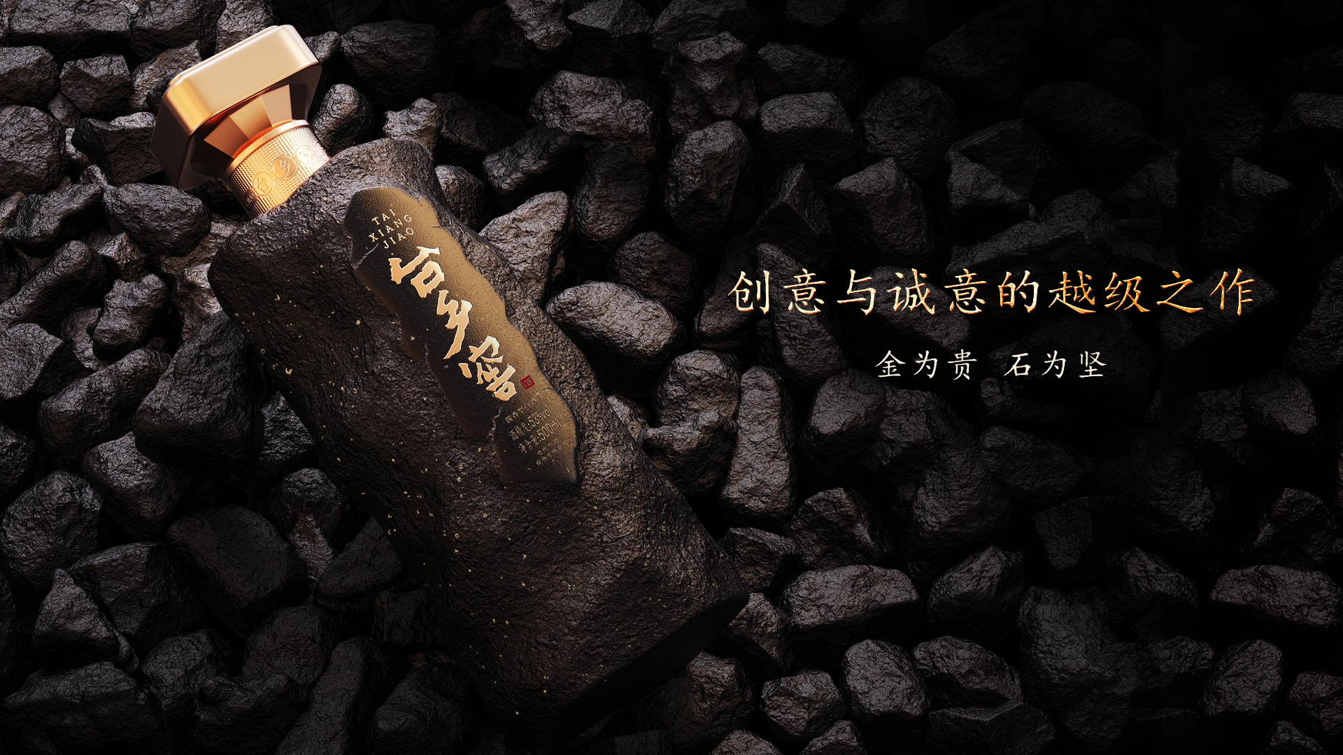
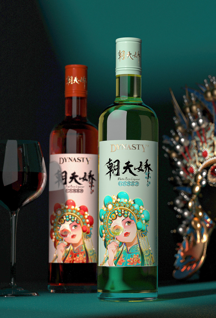


合作客户:台乡窖/摘要/荣和/五粮液/王朝酒业/西夏王/长城/巴格斯/雪花/海伦司
酒水穿新衣,设计找古一。大家好,我是古小一。古语常说人靠衣装马靠鞍,视觉审美的重要性古人早已告诉我们,所以说如今我们想要产品卖得好,自然还得靠外包装。随着经济的发展,即便是再小众的品类市场,也有不少的商品可供消费者选择,这也使得人们对于商品的要求随之提高。同时由于技术的提升使得同等档次的商品之间质量差异越来越少,那么消费者对于商品之间的选择便增添了许多附加值的考虑,例如审美体验上享受、品牌内涵上的精神共鸣、包装设计上的创新创意等等。小编今天给大家带来的是一款烈酒包装设计的分享,它从产品特性中提炼灵感来源,创造出浪漫而梦想的烈酒包装设计,大家一起来看看吧!

金酒,也叫杜松子酒,是世界第一大类的烈酒,它以其花香而闻名,因此Bloom & Blossom Craft Gin的包装系统融合了柔和的色调和令人惊叹的花卉意象,在光、色和液体之间创造出美丽的视觉对话。设计师通过在酒标背面加入水彩花朵的插画,当色彩和液体混合时,在光线下会发生一些神奇的事情,从正面看就如同一朵朵花儿在酒瓶中漫开。

植物药与精酿杜松子酒相互作用时也是如此奇妙。设计师正是通过此设计巧思捕捉到融合绘画和蒸馏艺术的精髓。独立的正面酒标设计既完成了作为传递产品信息的功能性作用,也使得消费者能够全面地欣赏光线与瓶子散发出的颜色之间的相互作用。整体包装设计浪漫而梦幻,与世面上炫酷、深沉的烈酒形象完全不同,也因此获得了极具识别性的产品视觉效果。


Gin is known for its floral notes, and when combined with packaging that romanticizes these flavors, the result is wistful. Designed by The Spice Agency, Bloom & Blossom Craft Gin's packaging system blends pastel hues and stunning floral imagery to create a beautiful visual dialogue between light, color, and liquid.
Something magic happens when colour and liquid mix, hues come alive as they interact with the fluid and the palette of tones interacts with the light. So too is the case when botanicals interact with craft Gin. By incorporating a watercolour image of blossoms at the rear of our design, we have been able to capture the very essence of blending the arts of painting and distillation. A discrete vertical front label helps the viewer get the perfect vantage point of the imagery as well as a fuller appreciation for the interaction between the light and the colours the bottle exudes.
关于今天《原来烈酒包装设计也能如此梦幻而浪漫》的介绍希望对大家有所帮助,有想说的可以添加微信,古一设计深圳十多年经验的酒包装设计公司,想了解更多产品包装设计案例,欢迎访问古一设计官网:http://www.szgoing51.cn/古一设计品牌编辑部/整编,如有转载,请注明来自古一,谢谢。


 京公网安备11010102002019号