
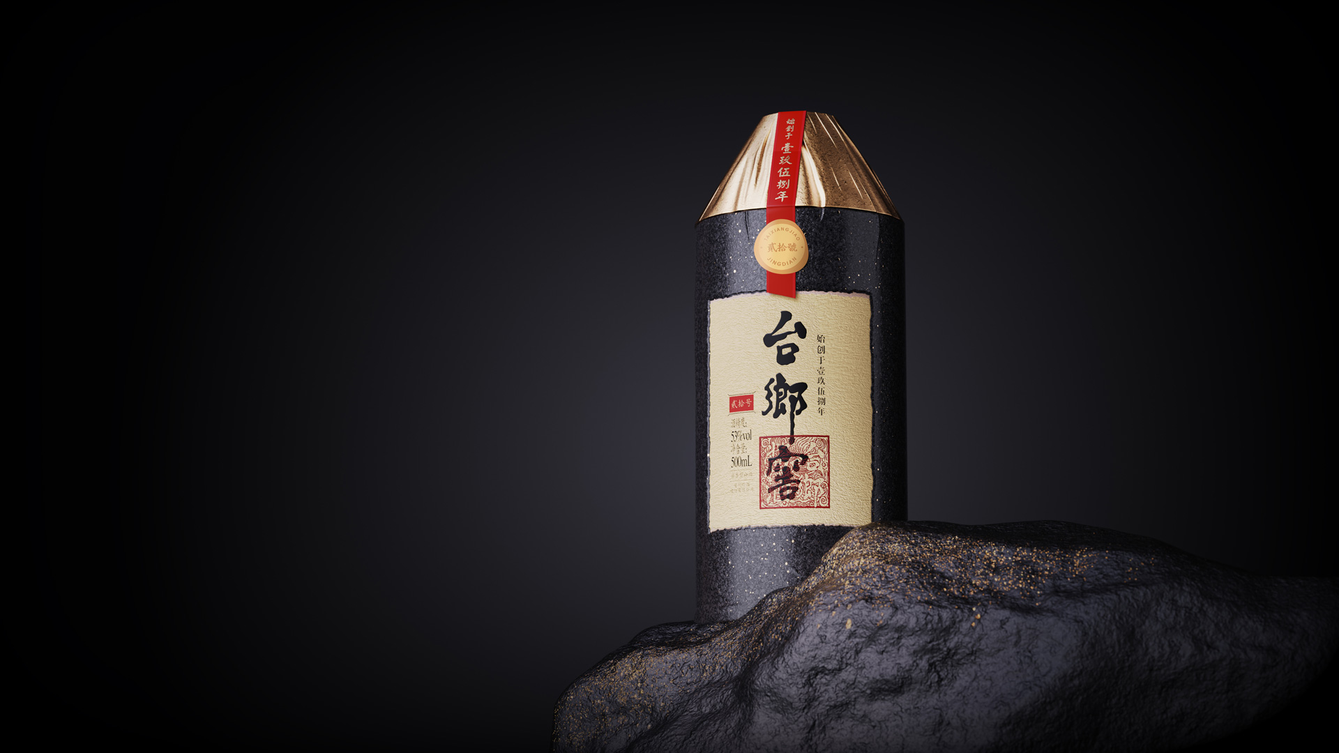
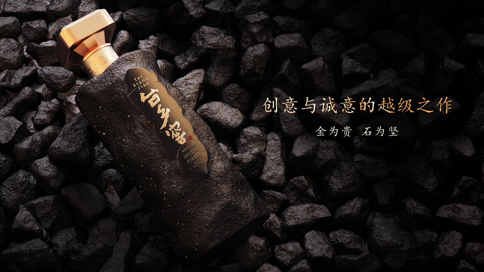
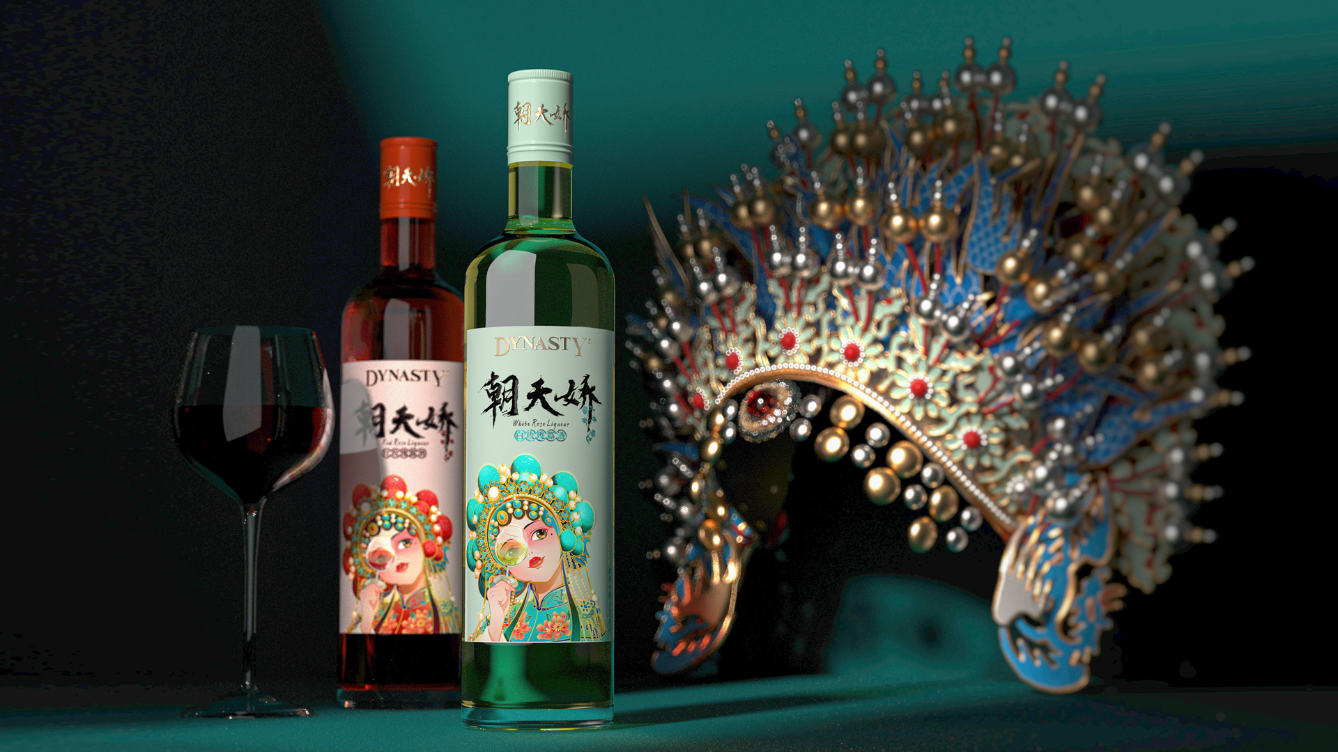
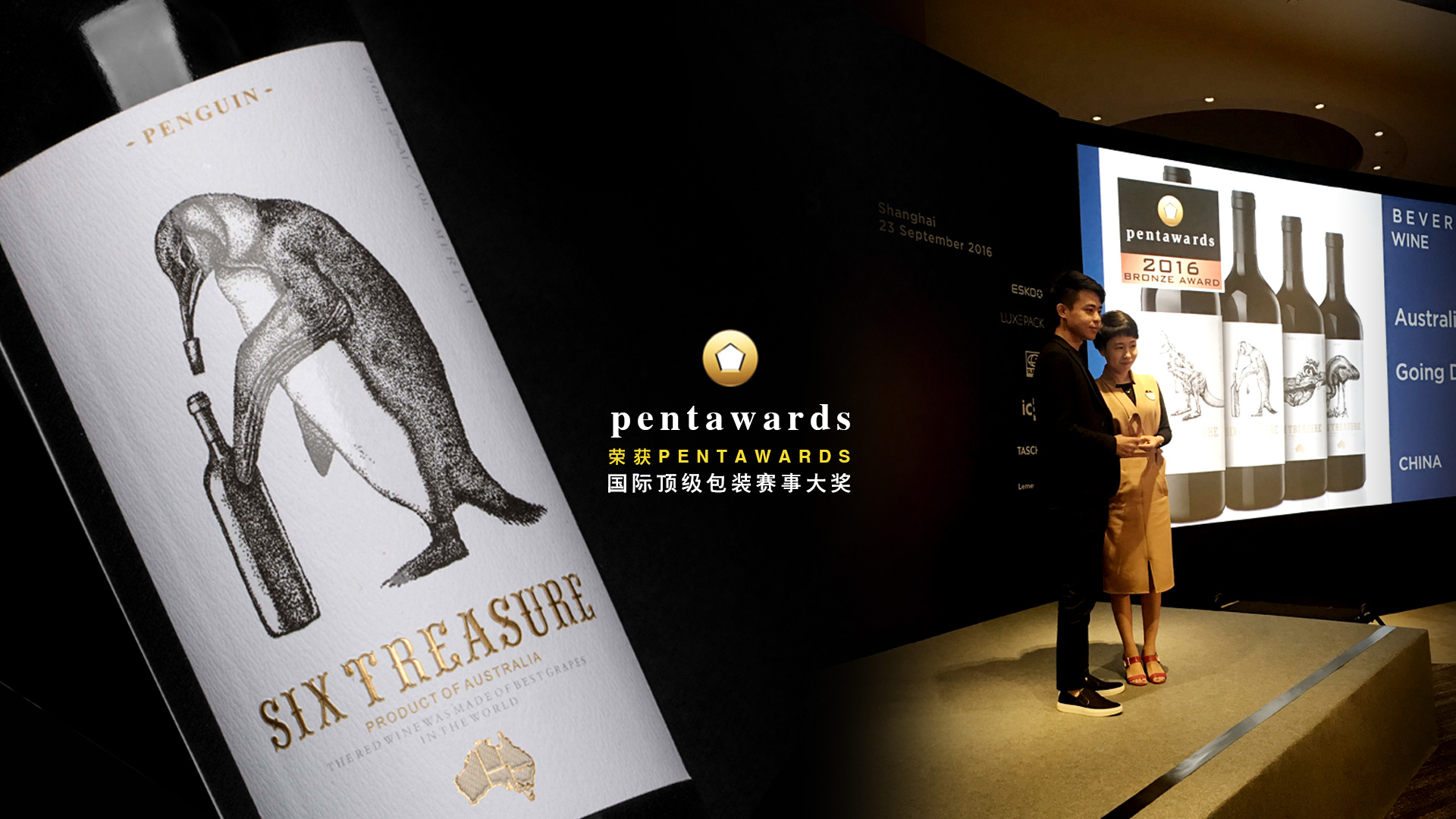
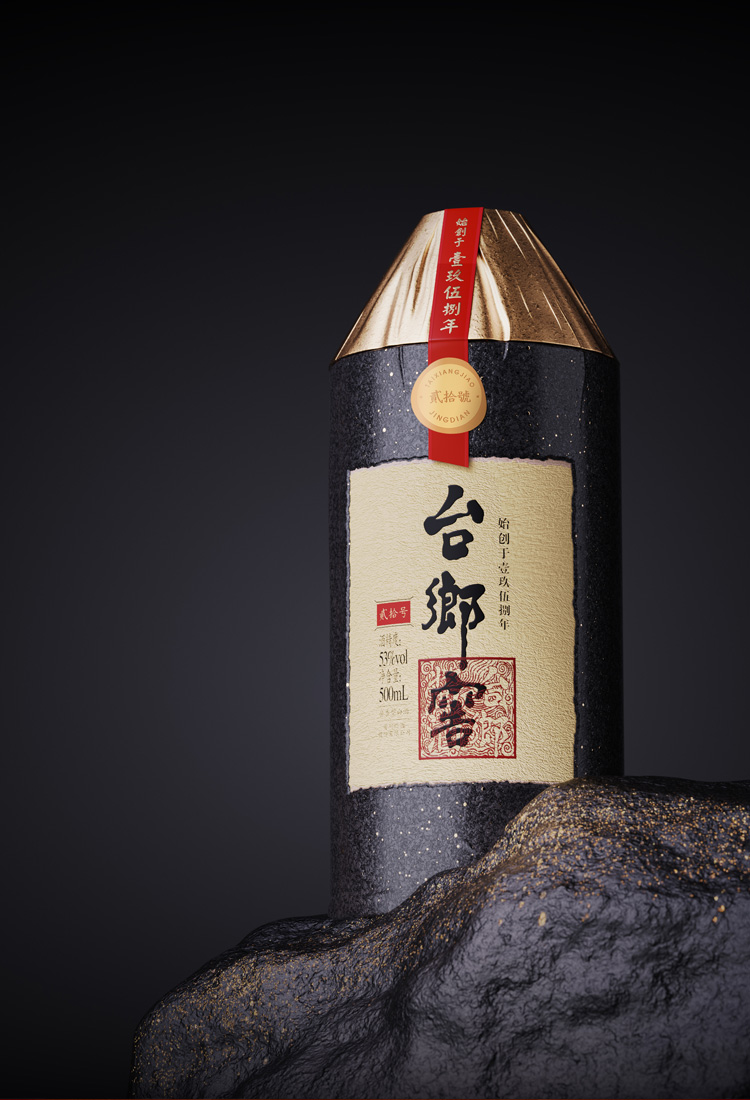
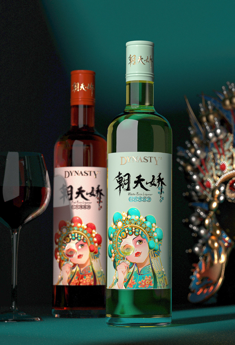
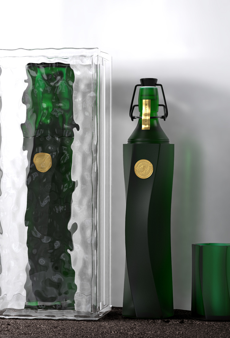
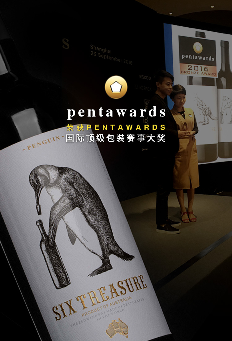
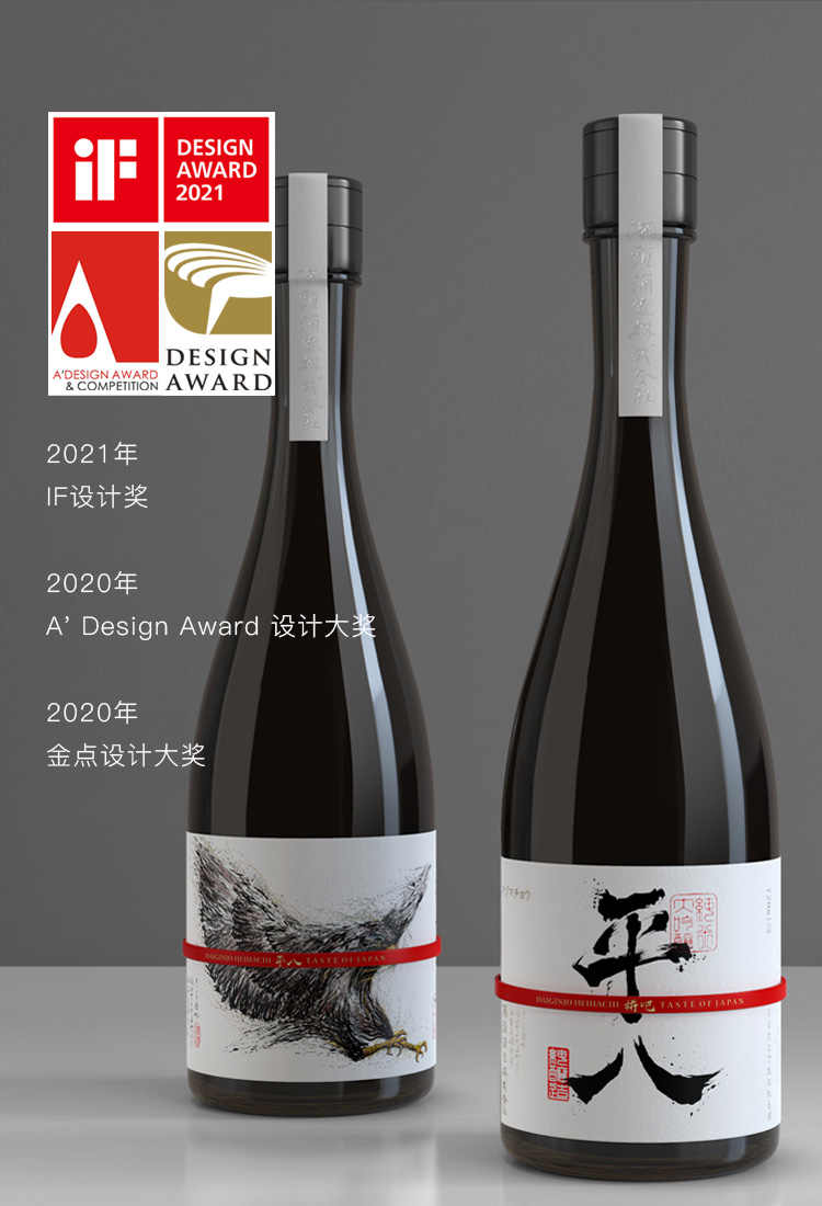

合作客户:台乡窖/摘要/荣和/五粮液/王朝酒业/西夏王/长城/巴格斯/雪花/海伦司
酒水穿新衣,设计找古一。大家好,我是古小一。随着信息时代的到来,大众传播兴起,人们无时无刻不生活在信息媒介的包围之中,久而久之人们对商品整体包装设计的审美要求也越来越高。而酒标设计作为酒商品中的一个微小但却起到重要作用的部分,不仅具有传递商品信息的实用性作用,还能够创新具有视觉效应的视觉吸引力,给人以艺术性美感。接下来小编就和大家分享来自Peace Vodka的洋酒酒标设计。

Peace Vodka是来自纽约的伏特加品牌,Peace Vodka寓意“和平伏特加”,其品牌名与包装灵感均来自位于生产地——纽约伯特利的酿酒厂,该酿酒厂距离 1969 年最初的伍德斯托克音乐节举办地仅一箭之遥,Peace Vodka因此将这一运动作为其洋酒包装设计的灵感来源。整体洋酒包装设计具有60年代末至70年代初的视觉风格,带着发光的彩色艺术品和强烈而简单的排版,将迷幻与现代主义融为一体。
酒标作双面设计,正面设计大胆而简约,由模切和单色设计突出,作出一只手在比耶的不规则标签,其背面标签则覆盖着明亮、多彩的插画,图中是和平鸽,与品牌名的“Peace”相呼应,插画被瓶中的液体放大和扭曲。通过这一酒标设计,将普通常见的透明玻璃酒瓶衬托得活力满满、五彩缤纷,极具特色。


Inspired by the distillery’s location in Bethel, New York, close to where the original Woodstock music festival took place in 1969, Peace Vodka's packaging visualizes the movement. Designed by Pulp & Pixel, the packaging system is entirely driven by late 60s and early 70s visual signals, with glowing, multicolored artwork and strong yet simple typography.Our design for Peace Vodka is in fact a re-design — the spirit had been in production for over 10 years under previous ownership. The name Peace Vodka is a nod to the distillery’s location in Bethel, New York, a stone’s throw from where the original Woodstock music festival took place in 1969.Our approach to this project was inspired by design trends of the late 60’s and early 70’s, embracing psychedelia with modernism. The label’s reverse is covered in bright, colourful artwork which is magnified and distorted by the liquid in the bottle, the front is bold and minimal, accentuated by the die cut and monochromatic design.
关于今天《Peace Vodka洋酒酒标设计》的介绍希望对大家有所帮助,有想说的可以添加微信,古一设计深圳十多年经验的酒包装设计公司,想了解更多产品包装设计案例,欢迎访问古一设计官网:http://www.szgoing51.cn/古一设计品牌编辑部/整编,如有转载,请注明来自古一,谢谢。


 京公网安备11010102002019号